
This blog post accompanies the SDPB Monday Macro Labor-Day edition, which airs on Tuesday, September 7, 2021. Click here to listen to the segment, which begins at minute 23:00 into the broadcast.)
Last Friday, September 3, the United States Bureau of Labor Statistics (BLS) reported that, in August, the number of employed persons grew by 235,000, while the nation’s unemployment rate fell to 5.2 percent. The report was a big disappointment: economists had expected the number of employed persons to grow by something closer to 1 million, just as this measure of payroll growth had done in June and July of this year. Clearly, the macroeconomic effects of and the policy responses to the pandemic have scarred labor markets in the United States. Moreover, on balance, the challenge seems to be one of generating labor supply—think, there are not enough employees to fill open positions—rather than one of generating labor demand. As I illustrate in Figure 1, the number of job openings (in red) in the United States has exceeded the number of unemployed persons (in blue) since May 2021.
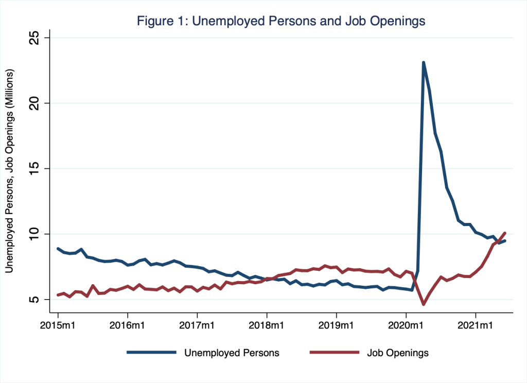
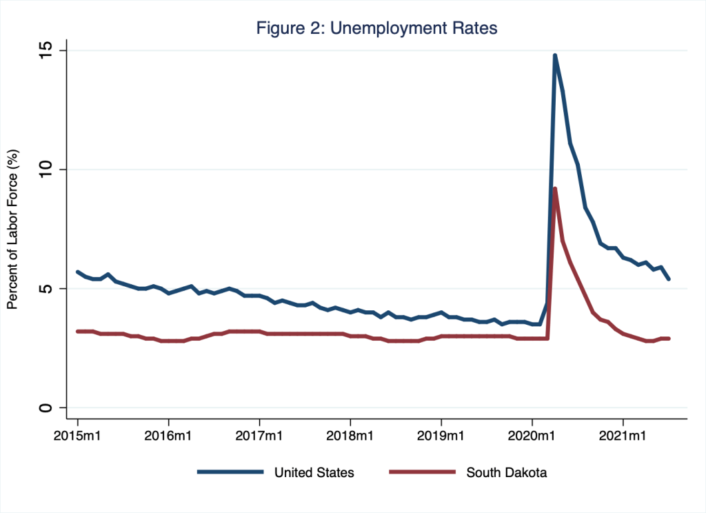
This difference between the number of job openings and the number of unemployed persons is a reliable, albeit broad, measure of aggregate labor-market conditions. As Figure 1 demonstrates, the number of job openings rose above the number unemployed persons as the United States economy neared the end of its decade-long business-cycle expansion in 2018. The measure then dramatically reversed course during the pandemic lockdown, when the demand for labor suddenly and dramatically decreased, before returning to its pre-pandemic pattern. This recent tightness in the (still-scarred) labor market is also evident from unemployment rates, which I illustrate in Figure 2. Indeed, the labor market in South Dakota, where the unemployment rate for July registered 2.7 percent, signals something very close to full employment.
As I discussed in a recent Schooled post (In Search of a Beveridge), labor markets are tight in part because, since the pandemic began, many circumstances have conspired to increase job-search time and effort among jobseekers. The most obvious of these is the pandemic itself; some jobseekers may wish to avoid the types of employment that might increase risks of exposure to COVID-19 and its variants. Meanwhile, some jobseekers may have prolonged their search in order to match more appropriately their skills and preferences to job vacancies, found their search efforts hampered by demands at home or disrupted by sectoral and geographical shifts of labor demand, or deemphasized the need to search because of extended and augmented unemployment-insurance benefits. Finally, some (former) jobseekers may have permanently left the labor force for reasons related directly or indirectly to the pandemic; think, for example, accelerated retirements. In any case, the United States economy continues to recover and, in doing so, close its output gap, the difference between economic output in a given quarter compared to economic output the economy would have achieved if it were operating at full capacity—or, as economists like to say, operating at potential; and, yes, potential output is a counterfactual estimate, a well-educated guess. In Figure 3, I illustrate the output gap.
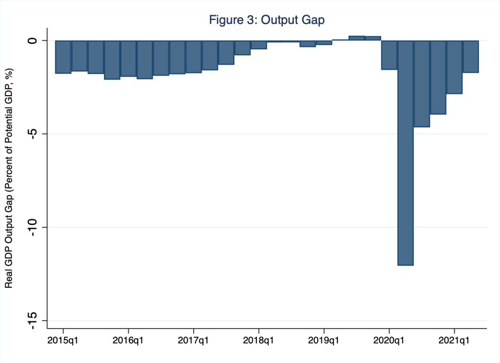
According to Figure 3, the output gap substantially narrowed—and essentially closed for a quarter or two—as the United States economy neared the end of its decade-long business-cycle expansion in 2018 (around the time when the blue bar in Figure 3 is neither significantly above or below zero); the gap then dramatically widened during the pandemic lockdown before narrowing once again. Generally speaking, as the output gap narrows, labor markets tighten, because labor inputs are required to produce output.
So, what’s up?
Wages, that’s what’s up, according to microeconomic theory.
Supply-and-demand theory teaches that extraordinarily tight labor markets bid up the price of labor; this is to say, tight labor markets unleash wage wars. The reason is straightforward enough. To fill a labor shortage, employers bid the wage—the price of labor services—higher. The bidding war has two effects that return the labor market to equilibrium: the quantity of labor demanded falls, because as the price of labor services rises, some employers can no longer justify hiring more labor (and so perhaps these would-be employers automate instead, for example); and, more importantly given our current situation, the quantity of labor supplied rises, because as the price of labor services rises, newly employed persons join the labor market. In effect, higher wages draw persons into employment whether from within or from outside the labor force.
But that’s just microeconomic theory; does the theory work in practice?
Yep, it does.
Gaining some aggregate sense of the average wage paid to workers in the United States economy at a point in time is not straightforward. Economists tend to favor two measures: namely, the employment-cost index (for wages and salaries) and average hourly earnings. The employment-cost index is a bit contrived, because by construction it assumes the proportion of workers in each industry remains constant through time even though workers leave industries at different rates. Whereas average hourly earnings is just what it claims to be, an average. So, for example, all else equal, when relatively low-paid workers leave employment, the employment-cost index is unchanged but average hourly earnings rise (much like my GPA rises if classes in which I received below-average grades are dropped from my GPA). Turns out, each measure has its strengths—and, of course, its weaknesses. In Figure 4, I illustrate both measures for the United States economy.
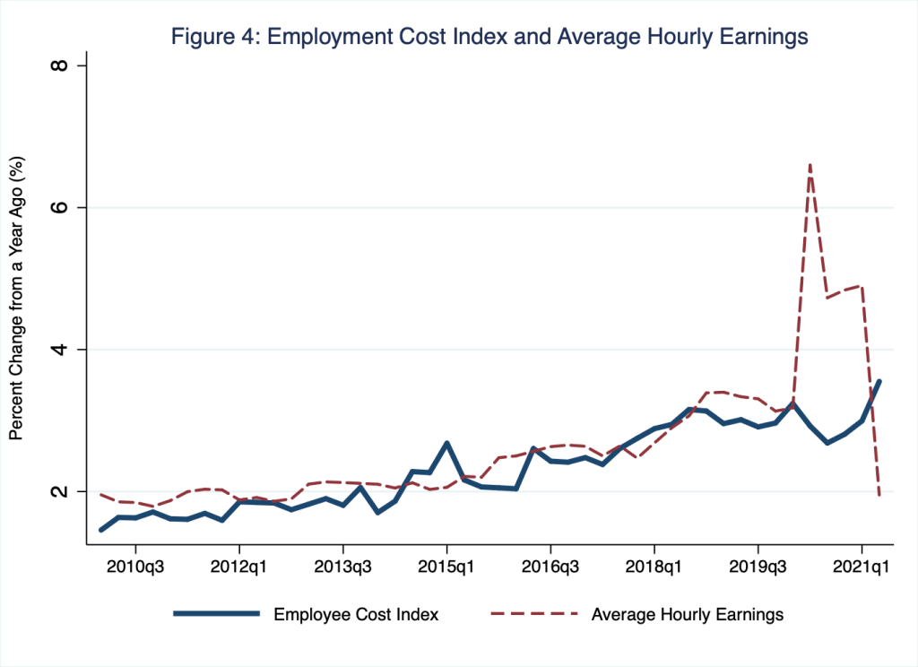
According to Figure 4, in the second quarter of 2020, when pandemic lockdown began, year-over-year growth in the employment-cost index (blue line) fell while growth in average hourly earnings (red dashed line) rose dramatically. This is because, in response to lockdown, the demand for labor generally fell, particularly in industries that produced services—not goods, as a practical matter—most vulnerable to the risks of exposure to COVID-19; think, for example, the leisure and hospitality industry. Coincidentally, wages in industries such as leisure and hospitality (and other industries that are similarly vulnerable to the risks of exposure to COVID-19), tend to be relatively low. Thus, as workers who earned below-average wages lost their jobs in disproportionately large numbers during lockdown, average hourly earnings rose (because workers who earned above-average wages kept their jobs in disproportionately large numbers). Nevertheless, lockdown diminished wage pressures, a fact that is evident from the fall in year-over-year growth in the employment-cost index. Bottomline, in the quarter in which lockdown began, labor markets loosened because the demand for labor fell; consequently, the growth of wages slowed.
That was then, this is now.
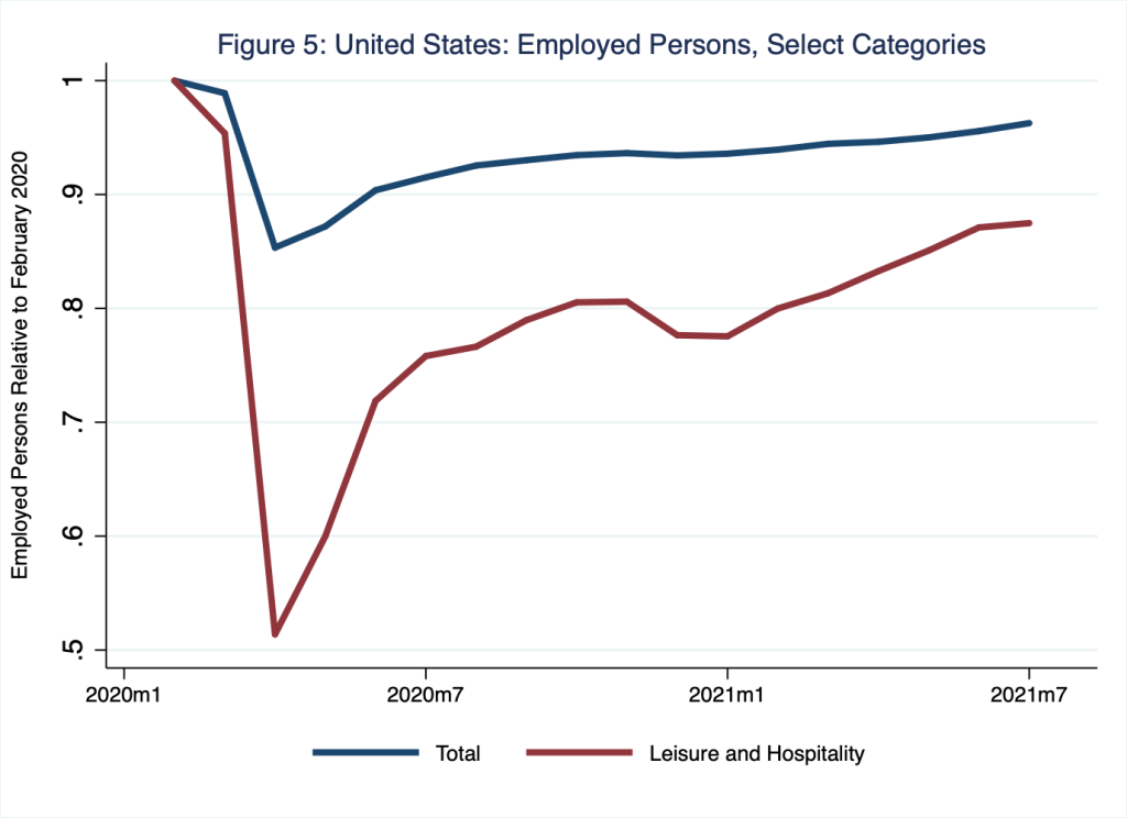
As Figures 1 and 2 illustrate, labor markets have tightened considerably since lockdown lifted; economic activity has recovered somewhat (Figure 3) and the demand for labor has increased accordingly. Meanwhile, the number of persons employed—think, labor supply—remains below the level the economy achieved just prior to the pandemic. For example, for the economy as a whole, 152.5 million persons were employed in February 2020 compared to 146.8 million persons employed now (as of July 2021), a gap of roughly 6 million persons; this employment gap quantifies the labor shortage that everyone is talking about. For the leisure and hospitality industry, which suffered the greatest loss in employment during lockdown, a gap of roughly 2 million persons remains. These patterns are visible in Figure 5, in which I illustrate employment levels for the economy as a whole (blue line) and for the leisure and hospitality industry (red line); for simplicity, I indicate employed persons in a given month relative to employed persons in February 2020. Thus, in this figure, a vertical-axis reading of, say, 0.88 (the most-recent observation for the leisure-and-hospitality industry) implies that the number of persons employed in that industry as of July 2021 equaled 88 percent of the number of persons employed in February 2020; thus, as of July 2021, an employment gap of 12 percent remained in that industry.
Unsurprisingly, then, wage pressures are rising, because the employment gap implies the demand for labor exceeds its supply. And, perhaps most interestingly, and as microeconomic theory would suggest, wage pressures may be rising fastest in industries, such as leisure and hospitality, where employment gaps remain the largest. This is to say, in those industries where the demand for labor has most outpaced the supply of labor—because the demand for labor has returned to something close to its pre-pandemic level but supply has not—wage pressures are likely greatest. (For more on why labor supply has not returned to its pre-pandemic level, see Monday Macro segment, “In Search of a Beveridge.”) For example, in Figure 6, I illustrate year-over-year growth in the employment-cost index for wages and salaries (blue line; copied from Figure 4) alongside the employment-cost index for wages and salaries for the leisure-and-hospitality industry.
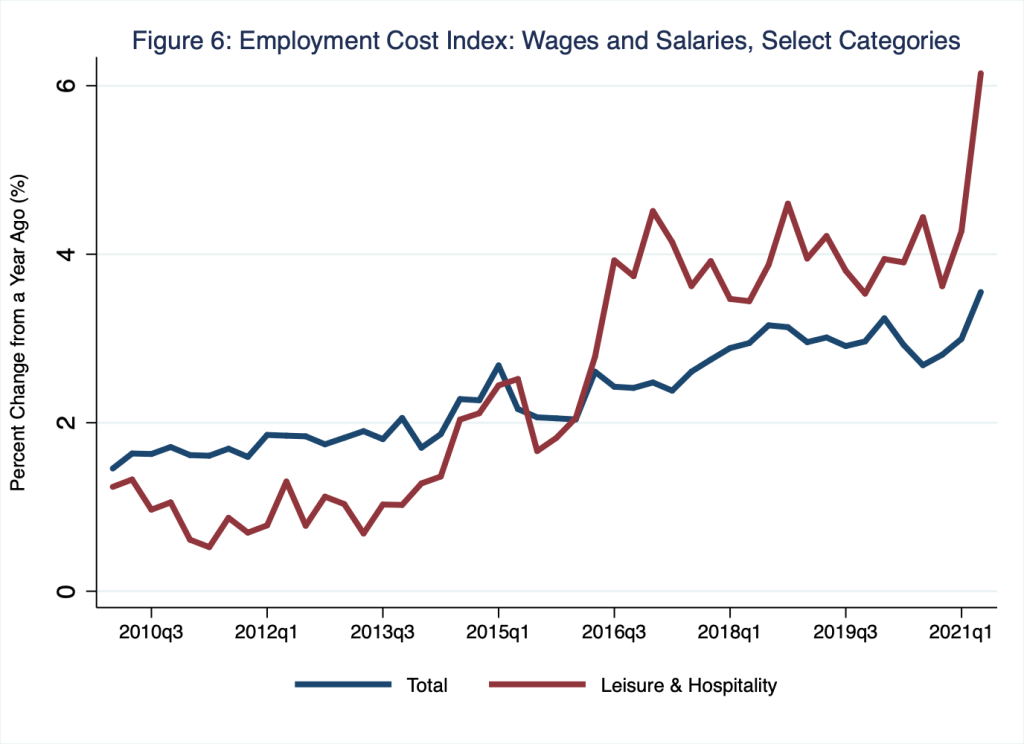
According to Figure 6, year-over-year growth in the employment-cost index for the economy as a whole (blue line) registered a relatively high rate of 3.6 percent in the second quarter of 2021. Meanwhile, year-over-year growth in the employment-cost index for the leisure-and-hospitality industry (red line) registered an astoundingly high rate of 6.1 percent in the second quarter of 2021. In Table 1, I report, for all BLS private-employment categories, employment gaps as of 2021 Q2 and year-over-year growth in the employment-cost index for wages and salaries.
Table 1: Employment Gaps and Wage Gains, All Industry Categories, as of June 2021
| Employment Category | Employment Gap relative to Feb 2020 (%) | Employment-Cost Growth in Q2 of 2021 (%) |
| Construction | 3.1 | 3.2 |
| Edu. and Health Services | 4.2 | 3.3 |
| Financial Activities | 0.8 | 3.7 |
| Information | 6.1 | 3.4 |
| Leisure and Hospitality | 12.9 | 6.1 |
| Manufacturing | 3.8 | 3.2 |
| Other Services | 5.0 | 4.2 |
| Prof. and Bus. Services | 2.9 | 2.8 |
| Trade, Trans., Util. | 2.1 | 4.0 |
| Total | 4.4 | 3.6 |
In the Table-1 column labeled “Employment Gap,” I report the current gap in the number of persons employed relative to the value the economy attained in February 2020. Thus, for example, the value of 3.1 percent associated with the construction industry indicates that an employment gap of 3.1 percent—roughly 238 thousand persons—remains in that industry as of the second quarter of 2021. In the Table-1 column labeled “Employment-Cost Growth,” I report the year-over-year growth in the employment-cost index for wages and salaries. Thus, for example, the value of 3.2 percent associated with the construction industry indicates wages and salaries grew year-over-year by 3.2 percent in that industry as of the second quarter of 2021.
To see how Table 1 relates to Figures 5 and 6, consider the leisure-and-hospitality industry: the value of 12.9 percent in Table 1 is the vertical distance of the gap between the value 1 and the June 2021 observation associated with the red line in Figure 5; and the value of 6.1 percent in Table 1 is the value of the Q2 2021 observation associated with the red line in Figure 6. Finally, to gain a better sense of how industry employment gaps and industry wages and salaries may be related, in Figure 7 I illustrate Table-1 information in a scatterplot, where the horizontal axis corresponds to the information in the Table-1 column labeled, “Employment Gap,” and the vertical axis corresponds to the information in the Table-1 column labeled, “Employment-Cost Growth.”
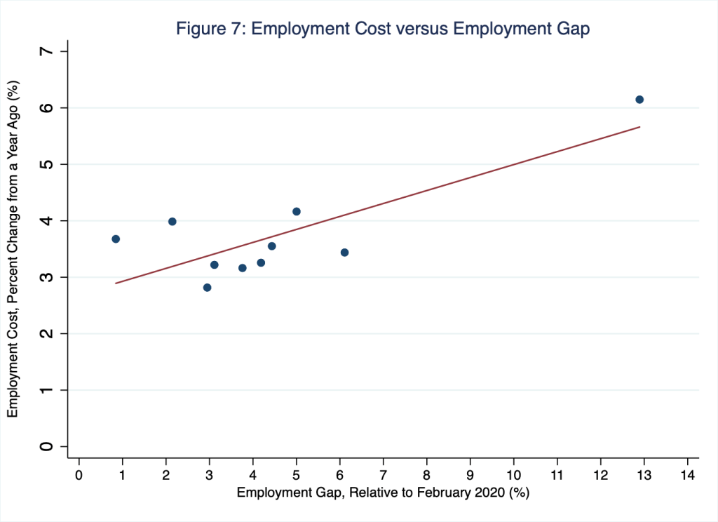
The points in Figure 7 correspond to the information across the rows in Table 1. Thus, for example, the observation in the far right corner of Figure 7 corresponds to the information in the row labeled, “Leisure and Hospitality” in Table 1, where the employment-gap entry is 12.9 percent and the employment-cost entry is 6.1 percent. Figure 7 suggests what microeconomic theory implies: wage pressures vary across industries based on industry-specific forces of demand and supply; and, perhaps most importantly, current wage pressures are greatest in those industries in which the employment gaps are greatest.
Indeed, these wage pressures are evident in the regional economy, as well. Employment-cost indices are not available for individual states. However, these data are available for United States census regions, including the Midwest census region, to which South Dakota belongs. In Figure 8, I illustrate year-over-year growth in the employment-cost index for wages and salaries for private industry in the Midwest census region.
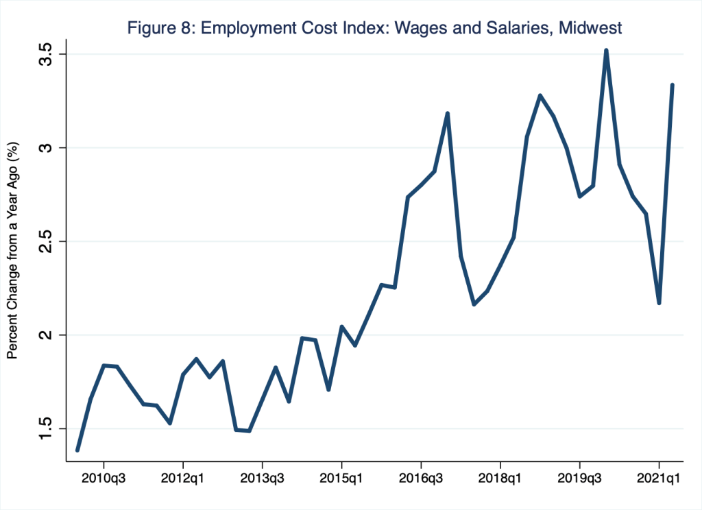
To be sure, the data I illustrate in Figure 8 are noisy; quarter-to-quarter variations in the data are large. Nevertheless, a clear pattern in Figure 8 emerges: wages in the region Monday Macro calls home are generally rising, much as wages throughout the United States are generally rising.
Workers of the world, celebrate! Right?
Not quite.
Wage gains are not necessarily purchasing-power gains. This is to say, because the average price level generally rises over time, the purchasing power of so-called nominal wage gains—gains in terms of dollars, as opposed to gains in terms of the goods and services that dollars buy—is eroded by the rate of inflation. For the last several months, the rate of inflation has registered year-over-year values in the range of 5 percent. For example, in Figure 9, I illustrate inflation as measured by the year-over-year percentage change in the consumer price index.
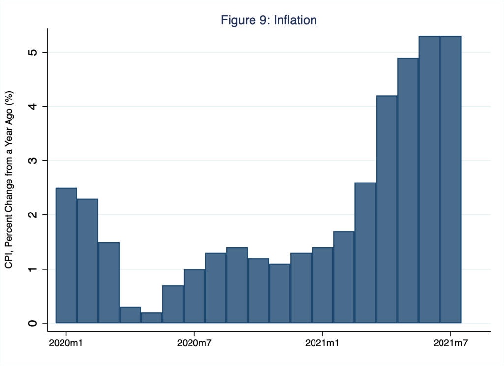
A cursory visual comparison of Figures 7 and 9 suggests that only in the leisure-and-hospitality industry have nominal wage gains, in the range of 6 percent, generally outpaced the rate of inflation, in the range of 5 percent. In other industries, wage gains have generally lagged the rate of inflation. Meanwhile, a cursory visual comparison of Figures 8 and 9 suggests that, on balance, nominal wage gains in the Midwest census region have not so far outpaced the rate of inflation. Of course, wage gains across industries could persistently outpace the rate of inflation sometime in the near future. If so, workers will gain purchasing power. Though, if wage gains across industries persistently outpace the rate of inflation beyond the rate of labor-productivity gains, these wage gains could, in turn, fuel inflation.
We don’t call it the dismal science for nothing.

One thought on “wagering on recovery”