
![]() This blog post accompanies the SDPR Morning Macro segment that airs on Monday, January 27.
This blog post accompanies the SDPR Morning Macro segment that airs on Monday, January 27.
In the last episode of Morning Macro (“California Dreaming“), I alluded to the presidential address that Alvin Hansen delivered at the 51st annual meeting of the American Economic Association (Detroit, Michigan, December 28, 1938), where Hansen spoke on “secular stagnation—sick recoveries which die in their infancy and depressions which feed on themselves and leave a hard and seemingly immovable core of unemployment” Hansen (1939, 4). Hansen identified the principal sources of economic progress as “(a) inventions, (b) the discovery and development of new territory and new resources, and (c) the growth of population. Each of these in turn, severally and in combination, has opened investment outlets and caused a rapid growth of capital formation” (Hansen 1939, 3). Essentially, Hansen argued these three principal sources generate economic progress through investments in capital.
Currently, the United States economy is in the expansion phase of its business cycle—the longest expansion in Post-WWII U.S. history, in fact. Nevertheless, the expansion is also the weakest in Post-WWII U.S. history. (For more on business cycles, see the Morning Macro segment, “Growing Old(er).”) To some macroeconomists, the United States appears to be in a secular stagnation of a sort Hansen described; growth in output and the rate of inflation are low, the outcomes of low aggregate demand perhaps. And many of these economists advocate for increases in investment expenditures in order to increase capital formation.
But does the United States economy have a capital-formation problem?
As Morning Macro devotees know, the average annual growth rate of output per capita, which economists think of as economic growth, is determined largely by labor productivity, which economists define as output per hour of labor input. For example, from 1960 to 2018, the average annual growth rates of output per capita and labor productivity in the United States each equalled 2.0 percent. Thus, changes in labor productivity almost entirely explain economic growth. And, Morning Macro devotees also know that the quantity of capital per labor input and technology determine labor productivity. Specifically, over time, increases in the quantity of capital and improvements in technology increase labor productivity, driving economic growth.
At any moment in time, capital—or, more formally, the capital stock—includes residential and nonresidential capital; residential capital includes the (residential) housing stock, whereas nonresidential capital includes equipment, (nonresidential) structures, and intellectual-property products such as software, for example. Technology—or, more formally, the knowledge stock—includes our understanding of the methods of production. In effect, saving—think, foregoing consumption—increases capital; and innovating improves technology.
In an earlier post [“(Iron) Curtain Call“], I (rightly) emphasized the important role that technology plays in driving economic growth. Because labor productivity exhibits diminishing returns to capital, accumulating capital is not, on its own, an effective way to sustain economic growth; an economy must improve its technology as well. Nevertheless, our standard of living depends on the capital stock, in no small part because capital formation often stimulates improvements in technology.
Over time, the economy accumulates capital through investment, which the economy funds with the portions of income that households, firms, and governments save. Thus, investment expenditures can be private (when households and firms invest in additional capital) or public (when the government invests in additional capital). Macroeconomists refer to the private investment-expenditures component of GDP as investment expenditures; meanwhile, we include public investment expenditures in the government-expenditures component of GDP. In Figure 1 (which also appears as Figure 1 in the post, “All Consuming“), I illustrate the four expenditure components that comprise GDP annually; net exports comprise an area (in blue) below the x-axis because net-export expenditures have been negative—we have purchased more foreign goods and services than foreigners have purchased of our goods and services.
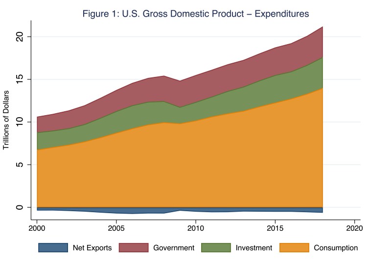
According to Figure 1, investment expenditures (in green) currently comprise about 17.5 percent of aggregate expenditures—the sum of consumption, investment, government, and net-export expenditures—and, thus, GDP. In the United States, investment expenditures and government expenditures (in maroon) comprise roughly equal shares of aggregate expenditures. For example, in 2018, both investment expenditures and government expenditures registered roughly $3.6 trillion (of GDP of $20.6 trillion that year). This pattern has been rather consistent throughout most of the last century. Of course, macroeconomists care as much about the growth of GDP over time as they do about the level of GDP (and, thus, the investment-expenditures share of GDP) at a moment in time. In Figure 2 (which also appears as Figure 2 in the post, “All Consuming“), I illustrate the contributions of consumption, investment, government, and net-export expenditures to the annual growth in real GDP, where the height of, say, the maroon bar indicates the percentage-points growth of real GDP attributable to investment expenditures; and, yes, investment expenditures can contribute negatively to the growth in real GDP, thus the maroon bar for 2016 is positioned below the x-axis.
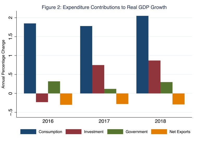
According to Figure 2, annual growth of investment expenditures contributes to the annual growth of real GDP, if only somewhat erratically. Consider, for example, the bars associated with 2018, when the annual growth of real GDP registered 2.93 percentage points—the sum of the heights of the four bars associated with 2018. Of these 2.93 percentage points of economic growth, consumption expenditures (in blue) contributed 2.05 percentage points, investment expenditures (in maroon) contributed 0.87 percentage points, government expenditures (in green) contributed 0.30 percentage points, and net-export expenditures (in amber) contributed negative 0.29 percentage points. Compare 2018 to 2016, when the annual growth of real GDP registered 1.64 percentage points. Of these 1.64 percentage points, investment expenditures (again, in maroon) contributed negative 0.23 percentage points. Thus, although investment expenditures do not comprise the largest share of aggregate expenditures—a distinction that belongs to consumption expenditures—they do comprise the most volatile component of aggregate expenditures, a pattern I will return to in a moment.
In Figure 3, I illustrate the three components of investment expenditures: namely, nonresidential, residential, and other—changes in firms’ inventories, for the most part.
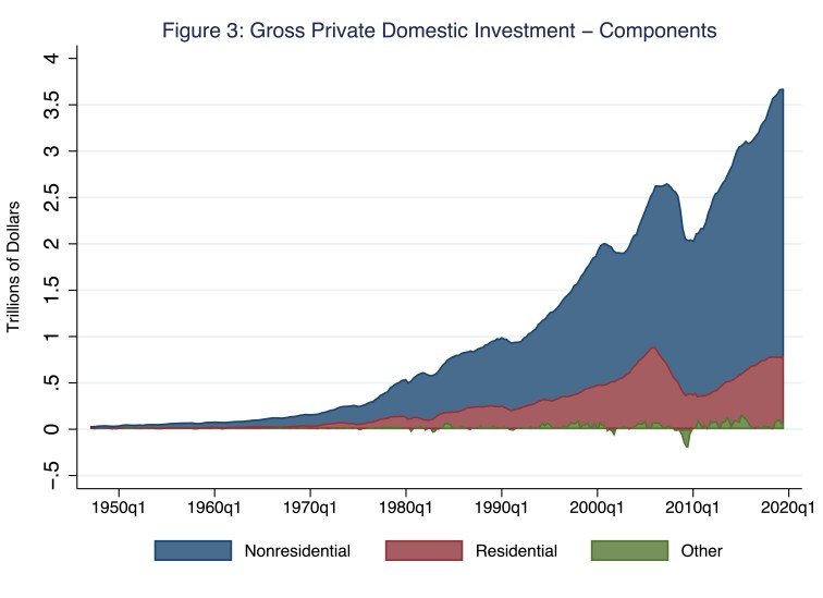
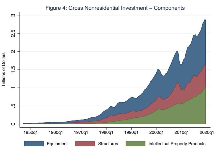
According to Figure 3, the largest component of investment expenditures is nonresidential, the majority of which consists of equipment and intellectual-property products (Figure 4).
Indeed, of the three components of investment expenditures (Figure 3), nonresidential investment is the most important driver of the nation’s productive capital stock. Put differently, though we may treasure our homes and, thus, value the (residential) housing stock, equipment, (nonresidential) structures, and intellectual-property products drive labor productivity. Lastly, and before we move on to how patterns of investment expenditures have shaped the United States capital stock, one more stylized fact regarding investment expenditures is worth noting: investment expenditures respond dramatically—and not in a good way—to business-cycle contractions. In Figure 5, I illustrate the annual growth of real—that is, inflation-adjusted—investment expenditures, which I separate into the growth in nonresidential and residential investment expenditures.
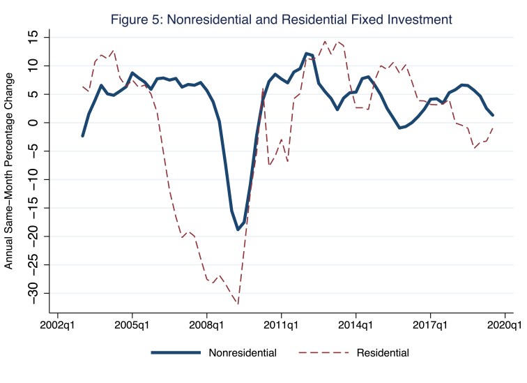
According to Figure 5, investment expenditures are pro-cyclical—as goes the business cycle, so typically go investment expenditures, which rise during expansions (when the lines in Figure 5 are positioned above the x-axis, indicating positive growth) and fall during contractions (when the lines in Figure 5 are positioned persistently below the x-axis). During the last (Great) recession, in the second quarter of 2009 alone, nonresidential and residential expenditures fell at annual rates of 19 and 32 percent! In stark contrast, in the same quarter, consumption expenditures (not illustrated in Figure 5), fell at an annual rate of only 2.3 percent.
Okay, so investment expenditures add to the capital stock.
Oh, if only it were that simple. Unfortunately, rust never sleeps.
Over time, the capital stock depreciates. In principle, we should account for depreciation because it effectively reduces the capital stock, regardless of the levels of investment expenditures. In practice, we should account for depreciation because the capital stock is enormous—roughly three times the size of GDP in any given year. Thus, even a relatively small rate of depreciation—a few percentage points, for example—produces a relatively large level of depreciated capital relative to GDP. One rather terrifying way to think about this is the following: in 2019, nonresidential investment expenditures registered $2.9 trillion, an addition to the capital stock equal to about five percent of the nation’s existing capital stock; so, all it would take to cancel out the positive effect that nonresidential-investment expenditures would otherwise have on the capital stock is a not-unreasonable five percentage-point rate of depreciation.
Surely macroeconomists factor in depreciation when they measure investment expenditures, right? Right. Precisely because the capital stock deprecates, macroeconomists distinguish between gross investment expenditures and net investment expenditures; the difference is the level of depreciated capital. In Figures 6 and 7, I illustrate gross and net private (Figure 6) and public (Figure 7) investment expenditures as shares of GDP; note, as a point of reference, the data point associated with the last observation for gross private domestic investment expenditures (Figure 6; blue line) is roughly 17.5 percent of GDP, the very same 17.5 percent to which I referred earlier in this post.
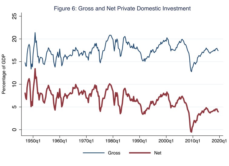
According to Figure 6, in 2019, the difference between gross private domestic investment expenditures (about 17.5 percent of GDP) and net private domestic investment expenditures (about 3.9 percent of GDP)—measured in Figure 6 by the vertical distance between the blue (gross) and maroon (net) lines—was 13.6 percent of GDP, or roughly 4.5 percent of the capital stock (which was roughly three times the size of GDP). Meanwhile, according to Figure 7, the difference between gross public domestic investment expenditures (about 3.4 percent of GDP) and net public domestic investment expenditures (about 0.7 percent of GDP)—measured in Figure 7 by the vertical distance between the blue (gross) and maroon (net) lines—was 2.7 percent of GDP, or roughly 0.9 percent of the capital stock.
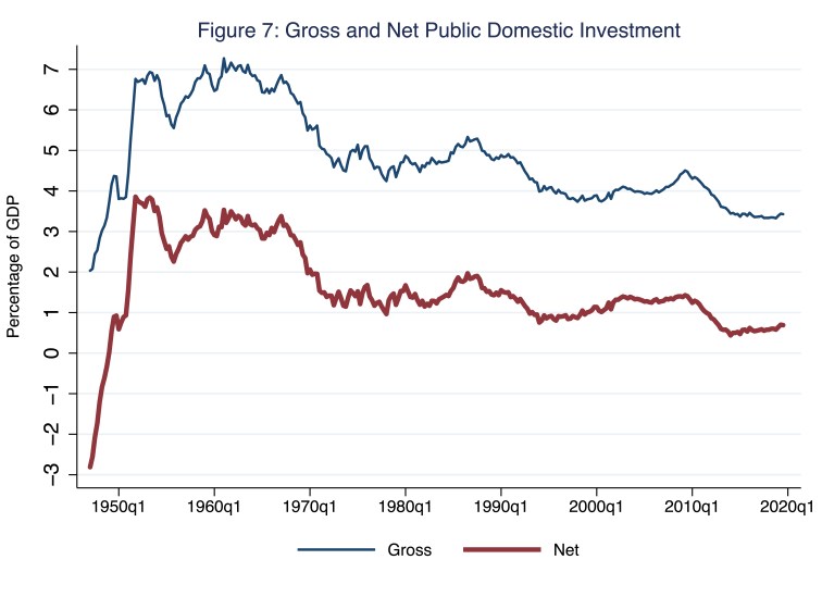
Perhaps former Treasury secretary Larry Summers had in mind Figure 7 during this year’s ASSA meetings when he opined, “Risks that we could excessively publicly invest are small.” Thus, over time, even though the economy funds gross private and gross public investment expenditures with the portions of income that households, firms, and governments save, the capital stock grows by the amounts of net private and net public investment expenditures, because the capital stock depreciates.
So how has the capital stock grown over time recently?
Brace yourself.
In Figure 8, I illustrate the growth in the real—that is, inflation-adjusted—capital stock.
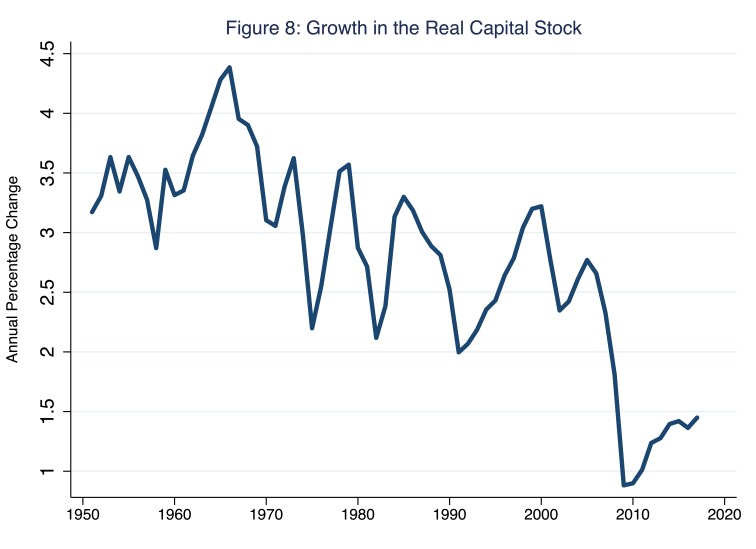
According to Figure 8, in 2017, the latest year for which data on the real capital stock (which is devilishly difficult to measure) are available, the real capital stock grew at an annual rate of 1.4 percent, after reaching a low of 0.88 percent during the last recession. Meanwhile, since the last recession, real GDP (not illustrated in Figure 8) has grown, on average, at an annual rate of about 2 percent. Thus, the growth in real GDP has outpaced the growth in the real capital stock; the ratio of capital to output has necessarily fallen. In Figure 9, I illustrate the real capital-to-output ratio, where the vertical axis measures the multiple of the real capital stock to real GDP.
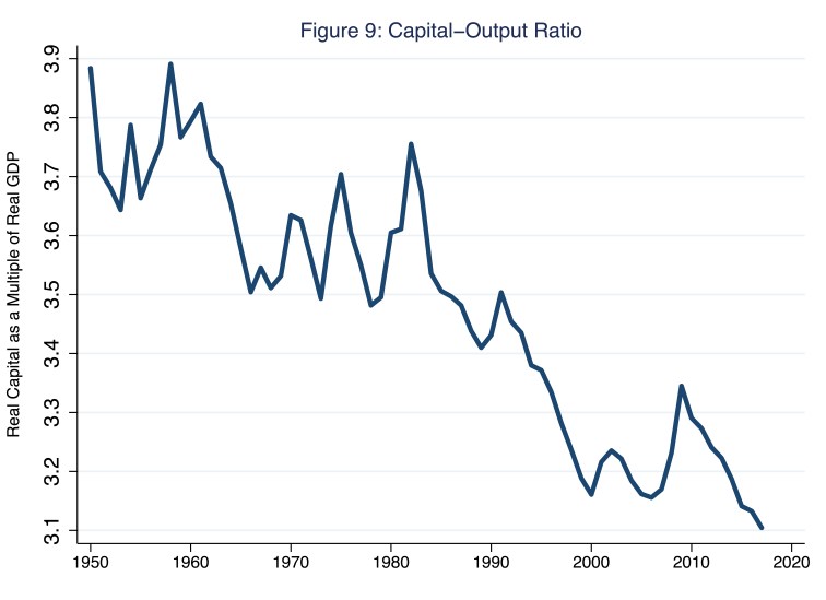
According to Figure 9, the capital-output ratio has generally fallen since 1950; though the ratio was relatively stable from about 1960 to 1990. With the exception of a large rise in the ratio during the last recession, when real GDP fell dramatically, the ratio has fallen quite precipitously since the great recession. Of course, arithmetically speaking, the ratio illustrated in Figure 9 could fall thanks to, say, a technology-fueled rise in labor-productivity growth and, thus, real output growth. In that case, the message to take from Figure 9 would be quite positive: since the last recession, the United States economy has continuously found ways to sustain economic growth by improving technology—better recipes, as it were, that transform the existing, slow-growing capital stock into greater and greater quantities of output. According to this interpretation, the capital-output ratio is falling thanks to unprecedentedly high growth in labor productivity. Unfortunately, as Morning Macro devotees know well, the growth of labor productivity since the last recession has been slower than at any time since 1950.
So, yes, the United States economy may indeed have a capital-formation problem.
References
Hansen, Alvin H. 1939. “Economic progress and declining population growth.” American Economic Review, 29 (1), 1-15.
