
![]() This blog post accompanies the SDPR Morning Macro segment that airs on Monday, April 1.
This blog post accompanies the SDPR Morning Macro segment that airs on Monday, April 1.
On Friday, March 22, 2019, it happened: the yield curve inverted, its slope going from positive to negative. As James Mackintosh for the Wall Street Journal reported, “The market’s most reliable recession indicator is finally flashing red.” Nevertheless, the yield curve is a bit of a Chicken-Little statistic: it over predicts the sky is falling. As economists like to joke, the yield curve has predicted nine of the last seven recessions. In any case, to understand what, if anything, the yield curve is telling us, we need to understand precisely what the yield curve is in practice and theory.
The yield curve plots the relationship between interest rates—or, so-called yields to maturity—on short-term bonds (like those that mature in, say, one year) and long-term bonds (like those that mature in, say, 10 or 30 years. A bond is a certificate of indebtedness, a so-called IOU, that a borrower sells to a saver; the saver buys the bond—think, lends funds to the borrower—in return for a yield to maturity. In Figure 1, I illustrate a yield curve—or, more formally, a (maturity) term structure of interest rates—that plots the relationship between annual yields on three hypothetical bonds and their corresponding to 1-, 2-, and 3-year terms to maturity.
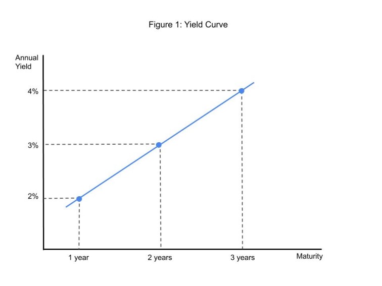
In the case I depict in Figure 1, the maturity of a bond is positively related to its annual yield: a bond that matures in 1 year offers an annual yield to maturity of 2 percent, a bond that matures in 2 years offers an annual yield to maturity of 3 percent, and so on. In principle, the bonds we use to construct a yield curve are identical in every respect except term to maturity; this is to say, the bonds present identical default risk, tax exposure, and so forth. Thus, in principle, the yield curve reflects, all else equal, the relationship between the maturity of a bond and its annual yield. So, in terms of Figure 1, a bond that matures in, say, 3 years offers a higher annual yield than a bond that matures in, say, 2 years precisely because the 3-year bond matures and, thus, returns principal and interest to the saver one year after the 2-year bond matures.
Typically, the yields we use to plot an actual yield curve are those on United States Treasury debt securities—essentially, Treasury IOUs with various terms to maturity. For example, short-term Treasury IOUs, which we often refer to as bills, mature in 1 year or less; intermediate-term Treasury IOUs, which we often refer to as notes, mature in between 1 and 10 years; and long-term Treasury IOUs, which we often refer to as bonds, mature in 10 years or more. The Treasury sells these securities, and thus accumulates debt, whenever federal government tax revenues fall short of expenditures, as they often do. (For more on the federal government debt, see the Morning Macro segment, “Fiscal Therapy.”). Today’s market value of Treasury debt outstanding is roughly $20 trillion, about $15 trillion of which is held by the public. Because the market for Treasury debt is large and active, and because all Treasury securities—bills, notes, and bonds—present identical default risk, tax exposure, and so forth, yields on Treasury debt make ideal yield curves. In Figure 2, I illustrate the annual yields on 10-year and 1-year United States Treasury debt.
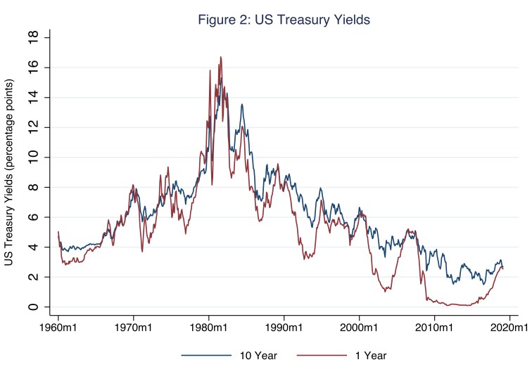
At any moment—take January 2010, for example—the vertical distance between the 10-year yield (blue line) and the 1-year yield (red line) essentially represents the slope of the yield curve between 1-year and 10-year maturities. Incidentally, we refer to this slope as the yield curve spread. A positively [negatively] sloped yield curve reflects a positive [negative] spread; and the steeper [flatter] the yield curve, the larger [smaller] the absolute value of the spread. In January 2010, when the 10-year and 1-year annual yields registered 3.73 percent and 0.35 percent, respectively, the yield curve was positive because the annual yield curve spread averaged 3.38 percent (because 3.38 = 3.73 – 0.35). More generally, then, Figure 2 effectively illustrates all in one place several yield curves (from 1960 to the present) for 1-year and 10-year maturities. Yet another way to effectively illustrate a yield curve is to illustrate the spread—the difference between the 10-year and 1-year annual yields illustrated in Figure 2 for example; doing so generates Figure 3.
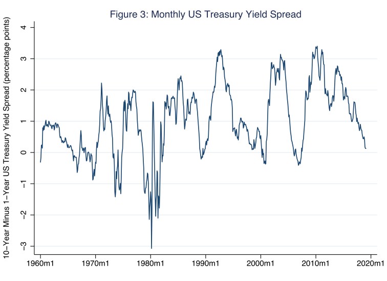
To understand how Figures 2 and 3 are related, consider the sample period 2010 to the present, during which the spread approached zero as the 1-year annual yield converged from below on the 10-year annual yield; or, put differently, in Figure 2 the red line rose and the blue line fell until the two lines nearly met. In Figure 3, this pattern is essentially represented by a falling positive spread—the difference between the 10-year and 1-year annual yields approached zero. Typically, yield curves are positively sloped, and so the spread illustrated in Figure 3 is usually positioned above the y-axis value of zero. Positively sloped yield curves are so common, we often refer to this outcome as normal: normally, savers demand a relatively high annual yield in order to part with their savings for a relatively long time. On rare occasions, the yield curve is negatively sloped; so the spread illustrated in Figure 3 is, on rare occasions, positioned below the y-axis value of zero.
Now is one of those rare occasions.
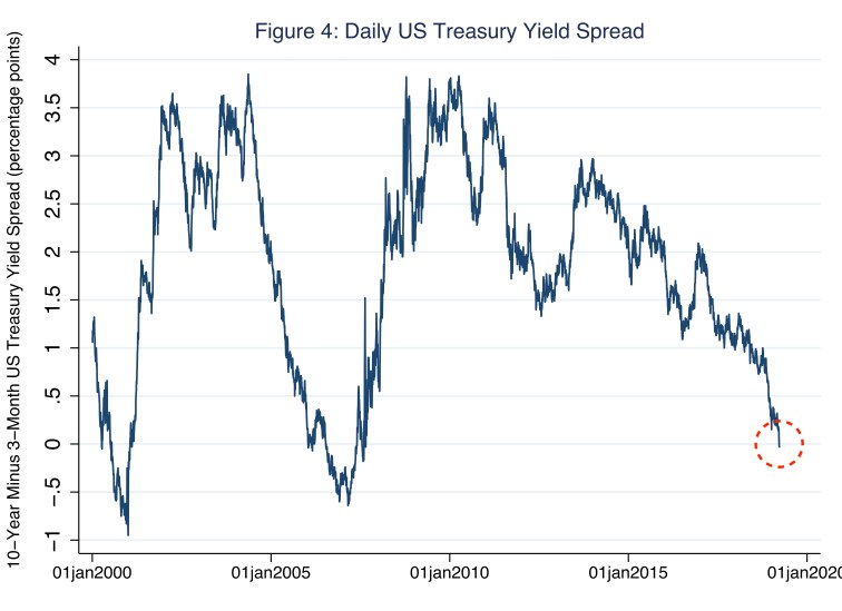
On March 22, 2019, the day the bond market inspired Mackintosh’s article in the Wall Street Journal, the 10-year annual yield on a United States Treasury bond fell below the 3-month annual yield on a United States Treasury bill by 0.02 percentage points. I illustrate this pattern in Figure 4, where the yield spread is the daily difference between the 10-year annual yield and the 3-month annual yield—a measure of yield on a very short-term United States debt security. The spread on March 22 is circled in red.
So negative yield spreads are rare; who cares? Turns out macroeconomists and everyone else care, because months—as opposed to a single day last week—of negatively sloped yield curves typically precede (by about a year or so) business-cycle recessions, which the National Bureau of Economic Research (NBER) defines as “a significant decline in economic activity spread across the economy, lasting more than a few months, normally visible in real GDP, real income, employment, industrial production, and wholesale-retail sales.” Consider Table 1, in which I report several three-month average yield spreads prior to a corresponding NBER-identified business cycle peak, which, by definition, is immediately followed by a business-cycle recession.
Table 1: 10-year minus 1-year US Treasury Yield Spreads (in percentage points)
| 12M Prior | 9M Prior | 6M Prior | 3M Prior | At Peak | Peak Date |
| 0.20 | 0.01 | 0.01 | 0.09 | -0.04 | 1957 Q3 |
| 0.34 | -0.10 | -0.33 | -0.08 | 0.39 | 1960 Q2 |
| -0.07 | -0.19 | -0.22 | -0.80 | -0.60 | 1969 Q4 |
| 0.94 | 0.29 | -0.21 | -1.30 | -0.66 | 1973 Q4 |
| -1.19 | -0.82 | -1.05 | -1.82 | -1.95 | 1980 Q1 |
| 0.82 | -1.42 | -1.16 | -1.38 | -1.47 | 1981 Q3 |
| 0.01 | 0.08 | 0.30 | 0.40 | 0.88 | 1990 Q3 |
| 0.29 | -0.04 | -0.24 | -0.33 | 0.45 | 2001 Q1 |
| -0.36 | -0.33 | -0.09 | 0.21 | 0.64 | 2007 Q4 |
Read Table 1 one row at a time from right to left, beginning with a peak date. For example, consider peak date 1980 Q1, the first quarter of 1980. In that quarter, the three-month average yield spread was -1.95 percentage points; this value appears in the column headed “At Peak.” In similar fashion, then, six months prior to the peak date, the three-month average yield spread was -1.05; this value appears in the column headed “6M Prior.” In Table 1, I emphasize negative yield spreads in blue font. Notice, for every recession represented in the table, save the recession that began immediately after peak date 1990 Q3, the three-month average yield spread was negative. And, indeed, in the case of the recession that began immediately after peak date 1990 Q3, the three-month average yield spread fifteen months prior to peak—which I do not report in Table 1—was -0.15. So, our current business cycle expansion, now about a decade old, is doomed; right?
Spoiler alert: yield curves do not cause recessions.
The most common explanation for the yield spread—and, thus, the shape of the yield curve—is the expectation theory, which rests on the efficient-market-hypothesis: market-clearing prices—in this case, yields to maturity—sensibly reflect all available information. According to the expectations theory, traders’ expectations of future short-term interest rates determine whether investors buy short-term or long-term bonds; and traders formulate unbiased expectations of the future. Traders commit forecast errors, just not in a systematic—think, predictable—way. Put simply, bond traders are rational, not clairvoyant. To understand what the expectations theory of the yield curve implies, consider the following simple—but powerful—example.
At the start of period 1, all traders wish to invest $1 for two years; and, to do so, traders may take one of two options. Traders may invest $1 for two years—the long term in my simple example—and earn in each of the two years the long-term annual yield of i2, which traders know at the start of period 1. In this case, the gross return at the start of period 1 on this long-term approach (RL) is the following.
RL = $1 × (1 + i2) × (1 + i2 )
Or traders may invest $1 for one year—the short term in my simple example—and earn in that first year the annual yield of i1, which traders know at the start of period 1; then traders reinvest the proceeds for another year and earn in that second year the annual yield of i1,2e, which traders do not know at the start of period 1. That is, at the start of period 1, traders must formulate an expectation (e) about i1,2e—that is, make an educated guess. In this case, the gross return at the start of period 1 on this short-term approach (RS) is the following.
RS = $1 × (1 + i1) × (1 + i1,2e )
Because all bond traders use all available information in a sensible way, and long-term and short-term investment options exist, traders’ collective expectation of i1,2e must be such that, at the start of period 1, RL equals RS. If this were not the case, then only the investment option with the unambiguously higher return would exist. This efficient-market-hypothesis argument implies that long-term yields—i2 in my simple example—and short-term yields—i1 in my simple example—are related in the following way.
i2 = ( i1 + i1,2e ) / 2
This is to say, long-term rates (i2) are the average of current and expected-future short-term rates (i1 and i1,2e, respectively). For example, suppose, as I illustrate in Figure 1, i2 equals 3 percent and i1 equals 2 percent; then, according to the expectations theory, i1,2e equals 4 percent, because 3 is the average of 2 and 4. Here, for simplicity, I use yields to one-year and two-year maturities; but, the relationship generalizes for longer terms to maturities: in general, long-term yields are the average of current and expected-future short-term yields. Thus, according to the expectations theory, an upward sloping yield curve generally implies that the market expects future short-term yields to rise above current short-term yields; a downward-sloping yield curve implies the opposite: the market expects future short-term yields to fall below current short-term yields. Finally, economists often slightly modify the prior equation in the following way.
i2 = ( i1 + i1e ) / 2 + λ2
The modification is the addition of a so-called term premium (λ), the additional yield investors demand because, all else equal (including the path of expected-future short-term rates), investors prefer to buy short-term bonds instead of long-term bonds. In plain English, investors need an additional percentage-point incentive, represented here by λ, in order to surrender their savings for relatively long periods of time; sound familiar? So, yield curves reflect the expectations—and, in the case of λ, preferences—of many, many yield-seeking investors, who have every incentive to sensibly use all available information to formulate unbiased expectations of future short-term yields. Whether investors expect future short-term yields to rise, fall, or stay the same, they could be wrong of course; but their educated (and profit-motivated) guess is probably the best one we have.
Thus, the conventional thinking goes, if the yield curve is negatively sloped because traders expect future short-term yields to fall, then traders likely expect weak economic activity, including, perhaps, a recession. This is because short-term yields are generally pro cyclical: yields rise and fall with the business cycle. So, for example, yields fall when, say, the flow of bonds falls (because firms have no reason to expand their operations, and borrow to do so, when economic activity is weak), or because the Fed lowers short-term interest rates (because the Fed wishes to stimulate the economy when economic activity is weak), or inflation is low (because planned aggregate spending is low when economic activity is weak). Thus, although yield curves do not cause recessions, yield curves reflect, in part, the market’s expectations of circumstances that correspond to the business cycle. All else equal, including the term premium (λ), negatively sloped yield curves likely reflect the market’s expectations of weak economic activity.

2 thoughts on “yield ahead”